White and black are more dominant than the secondary and accent colors. They are the colors for staging your communication. This maintains a color scheme that is generally minimalistic.

The secondary colors are used more subtly.

There are two different CMYK options for black: a four-color version for filled areas and a one-color version for text and fine lines.
White
HEX #FFFFFF, RGB 255-255-255, CMYK 0–0–0–0
Black
HEX #000000, RGB 0-0-0, CMYK 60-20-20-100 (filled areas),
0–0–0–100 (text and fine lines), PANTONE Process Black
All secondary colors can be used flexibly.

ZEISS Indigo is the color of our logo. Otherwise, it is used in the same way as the other secondary colors.
HEX #0F2DB3, RGB 15-45-179, CMYK 100-80-0-0,
PANTONE Reflex Blue C, RAL 5002

ZEISS Azure is the interaction color, making it the most prominent secondary color in user interfaces. It is used to highlight interactive elements, such as links or clickable areas. Otherwise, it is used in the same way as the other secondary colors.
HEX #0072EF, RGB 0-114-239, CMYK 80-45-0-0,
PANTONE 2925 C, RAL 5015

ZEISS Violet can be used to accentuate non-interactive elements, just like ZEISS Indigo and ZEISS Azure.
HEX #8F3CFB, RGB 143-60-251, CMYK 45-65-0-0,
PANTONE 2587 C, RAL 4005

ZEISS Lime is used exclusively for highlights. It should be used far less frequently than the other secondary colors.
HEX #D9E906, RGB 217-233-6, CMYK 20-0-80-0, PANTONE 388 C
Various gray scales are possible for black and white, depending on the requirements.
For digital touchpoints, there are separate colors and gray scales that can accommodate even more functions. The ZEISS Beyond Design System is available for this purpose.

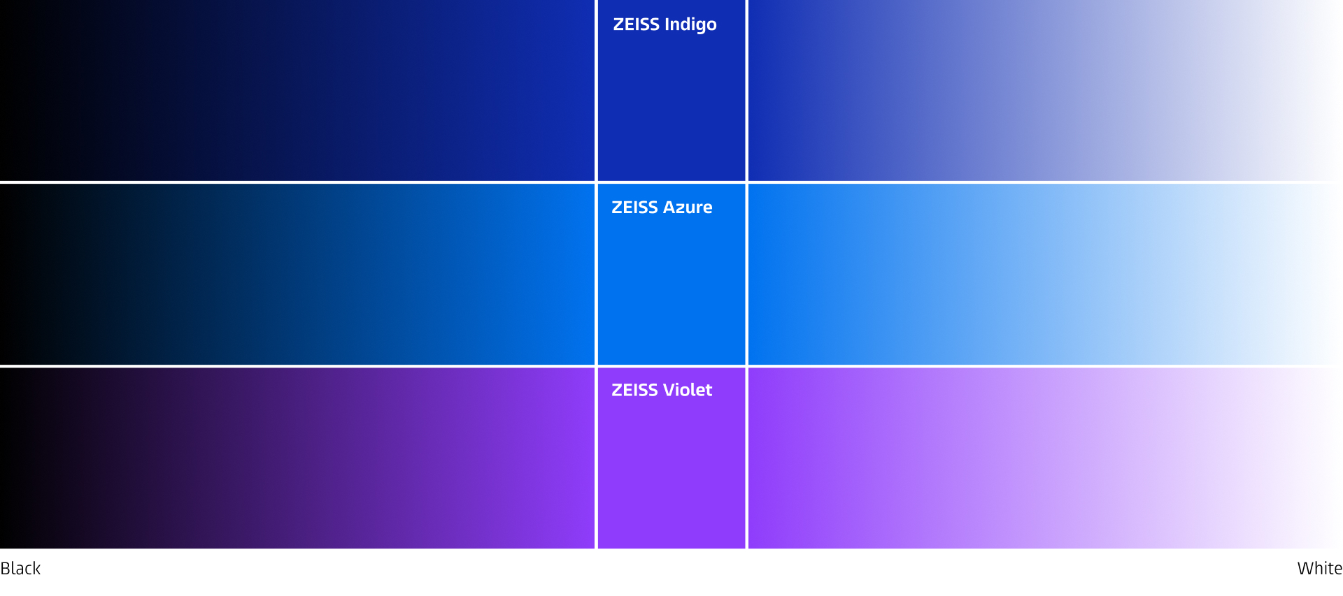
Give your graphics or visual more depth with gradients.
Only use one of the three secondary colors with the gradient transitioning to either black or white.
Ensure all gradients have the same parameters on a single asset, such as a PowerPoint slide.
Use color in text purposeful, e.g. if you need to draw attention and cannot achieve this via typographic means.
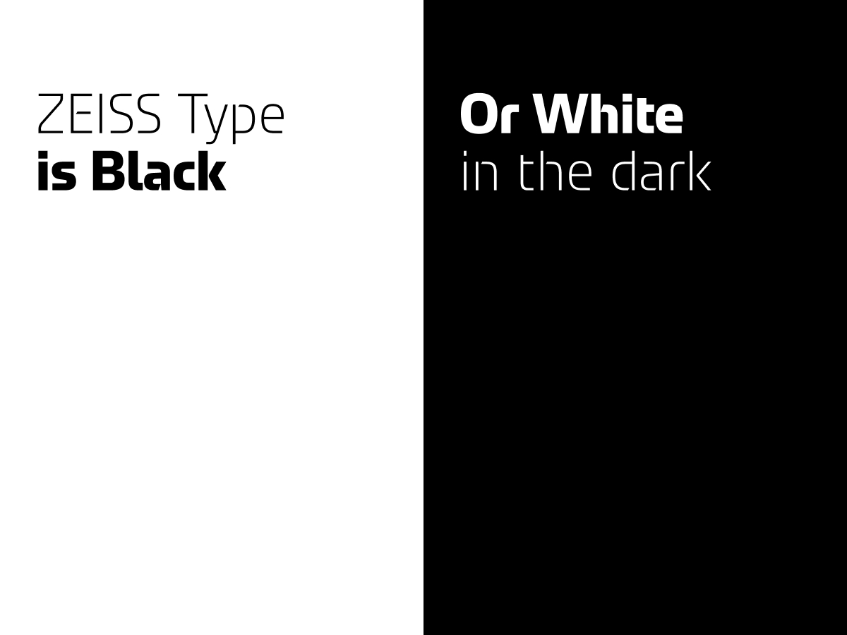
Prefer using black text on a white background or white text on a black background. Exception can be done, if needed for a specific reason.

Placing secondary or contextual colors next to each other or using them excessively

Colors or color gradients as image or video backgrounds

Decorative use of color in texts and headlines

Artificially colored material as secondary colors in spaces

Color shades of secondary or accent colors

Transparent colors
Corporate Brand, Communications & Public Affairs