A set of patterns applies to every icon for a consistent visual language. Some of these patterns help meet technical requirements, while others ensure formal and conceptual consistency.

The size of the grid and the stroke weight define the level of detail in each icon and the ability to add additional design features.
As a result, story icons will have more details than functional or expressive icons.
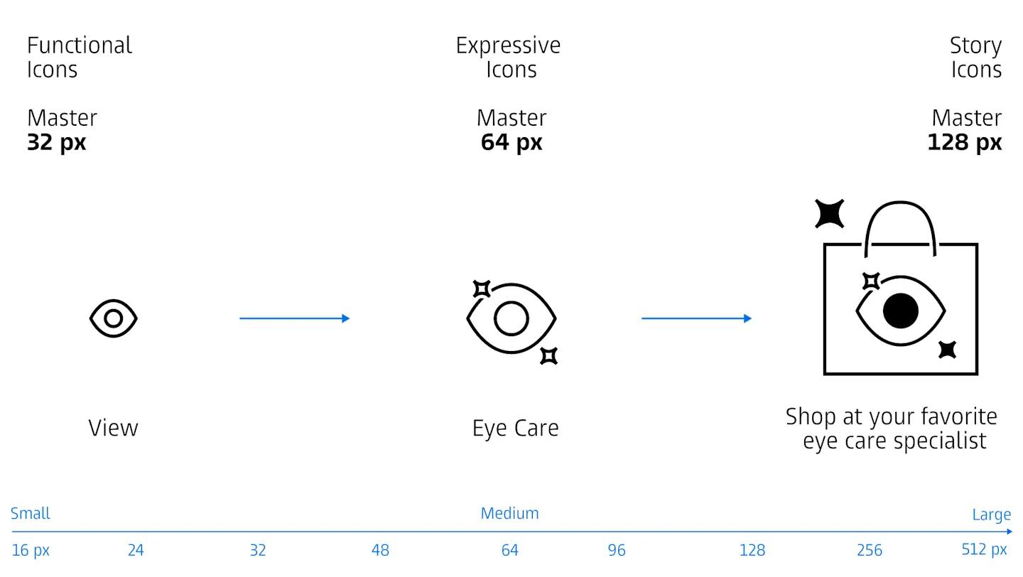
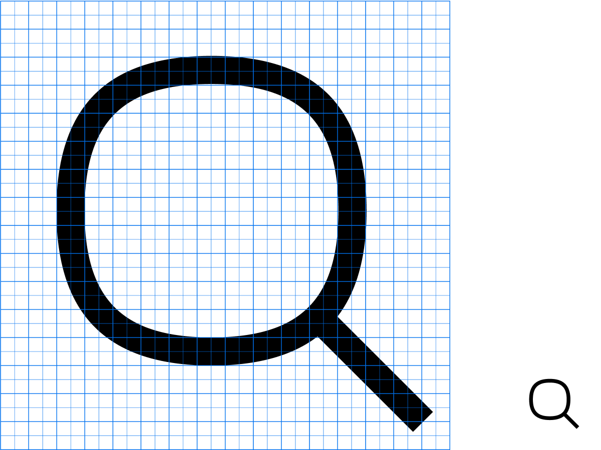
To depict familiar objects, we capture their essence while conforming to the design guidelines.
Icons should remain recognizable even when reduced to basic shapes.
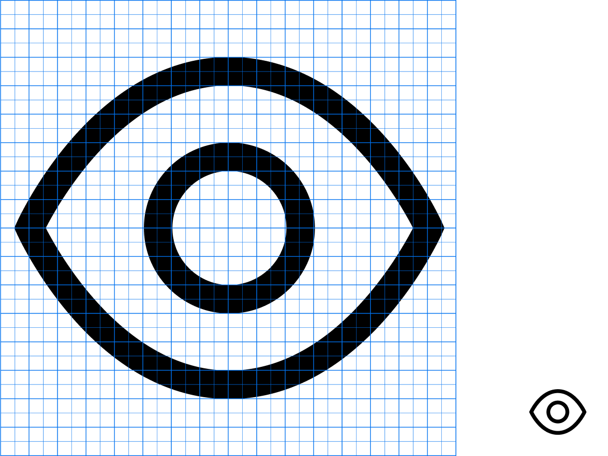
Every concept is represented with as few elements as possible. Avoid unnecessary visual complexity to ensure readability.
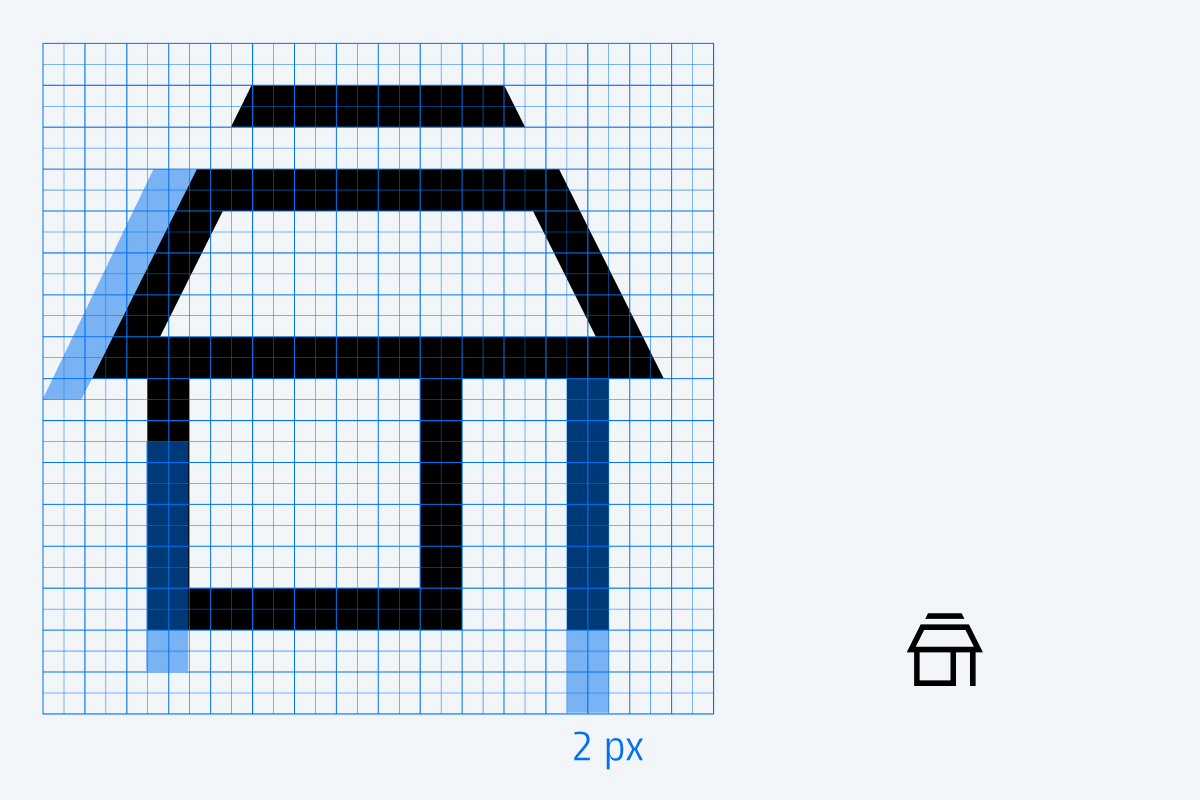
The thickness of the strokes does not change.
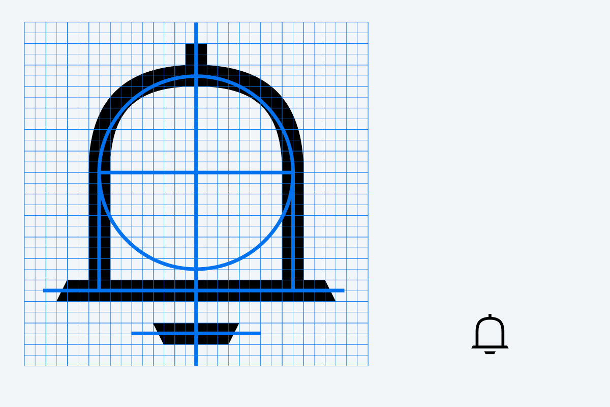
Following the grid, lines and curves are combined using basic geometric shapes.
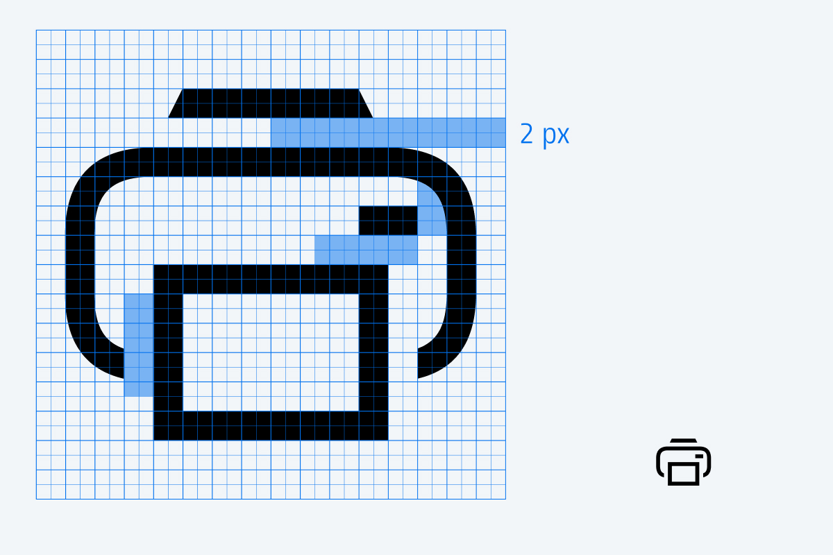
Shapes must be separated by at least 2 px.
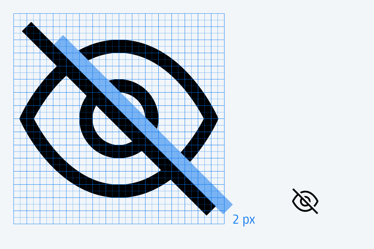
Overlapping elements must be separated by a 2 px cutout.
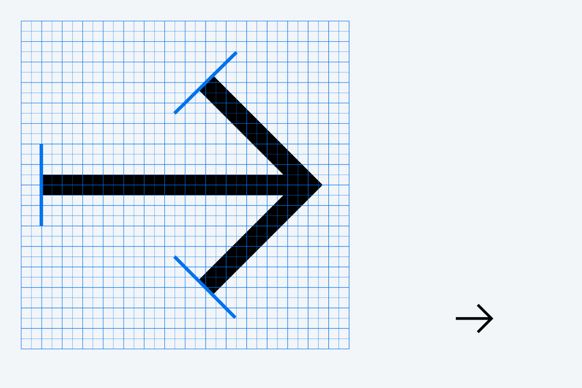
Stroke endings are always straight, never rounded.

Corners are rounded or sharp depending on their relationship to the physical object.
We use a consistent diagonal cut at stroke endings when it enhances functionality and personality without compromising legibility.
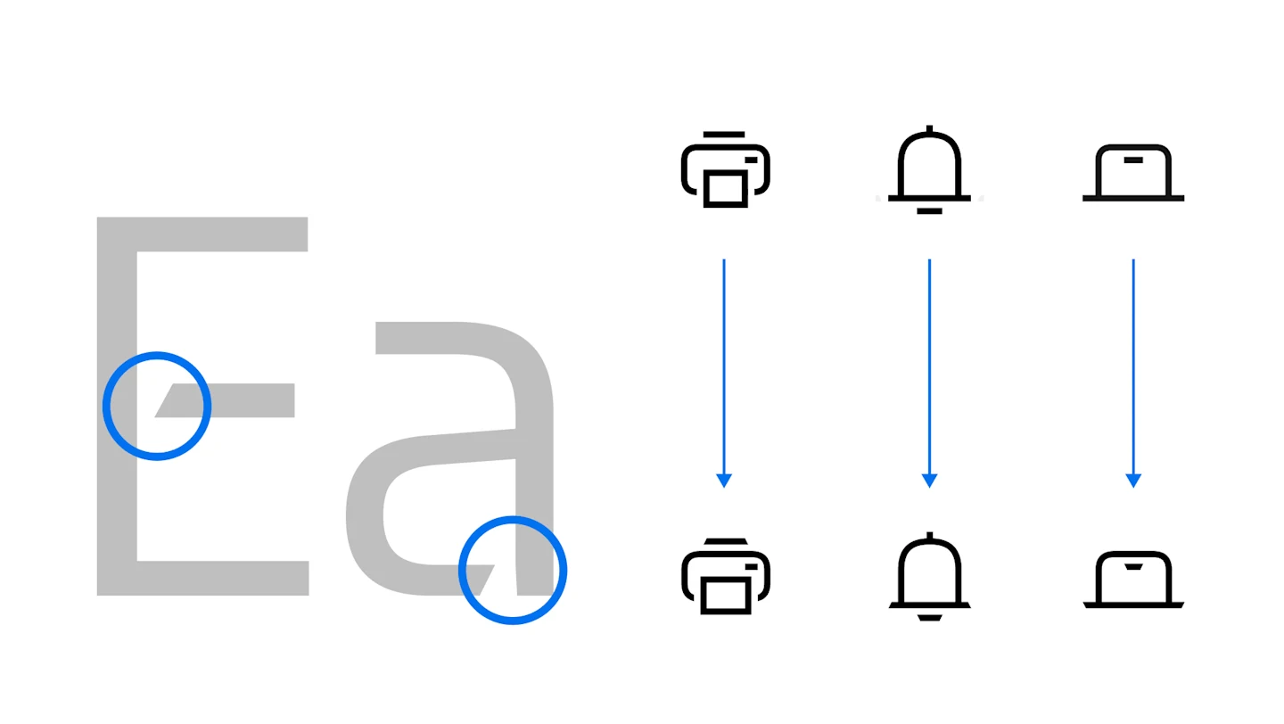
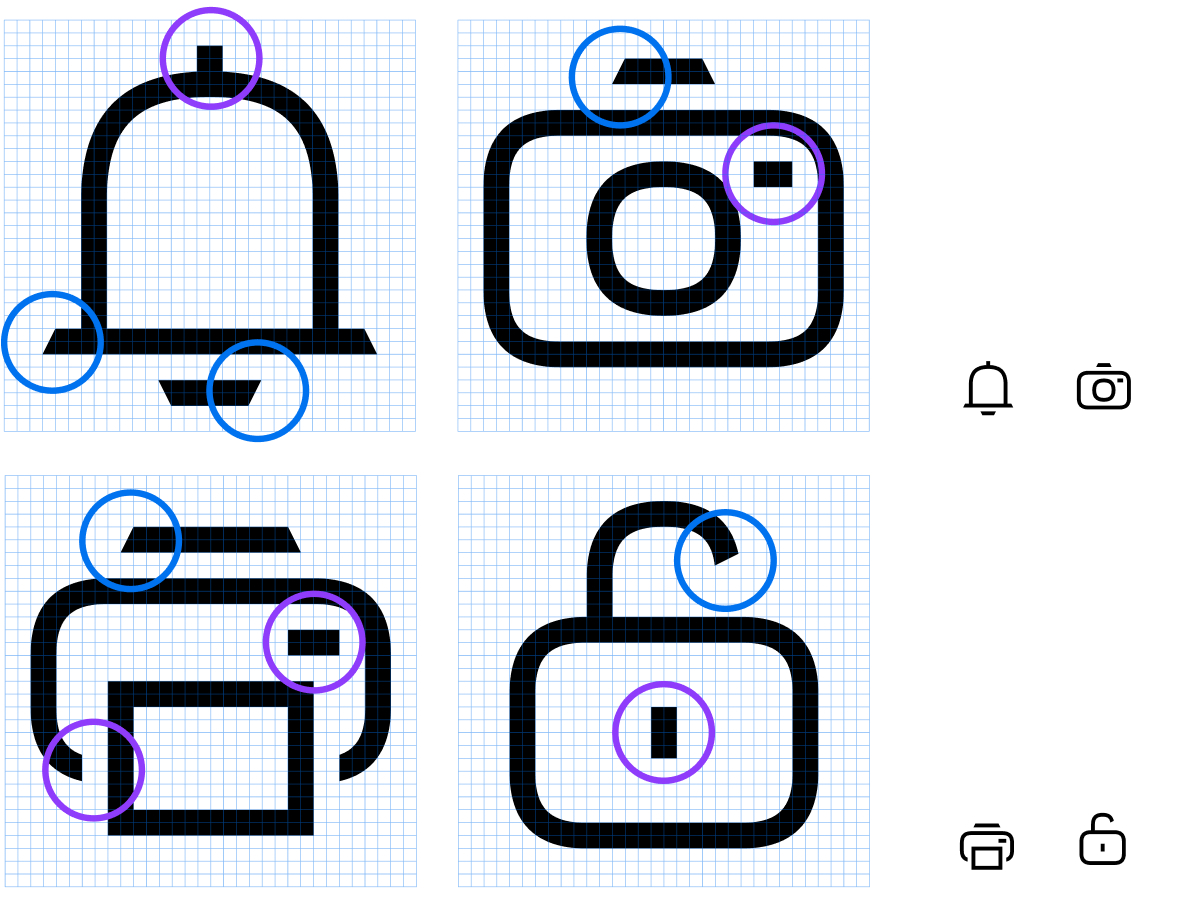
The slant is applied to stroke endings.
The slant is not used on overlays.
The slant is not used with small lines that function as dots.
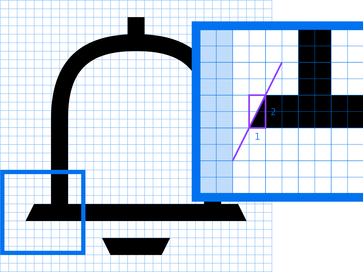
The slant is constructed using a 1:2 grid proportion, maintaining a consistent diagonal angle throughout the icon set.
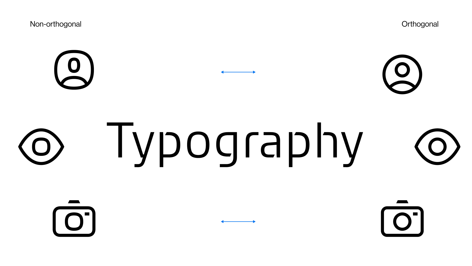
Curves should follow non-orthogonal constructions within the grid. Orthogonal curves can be used in special cases.
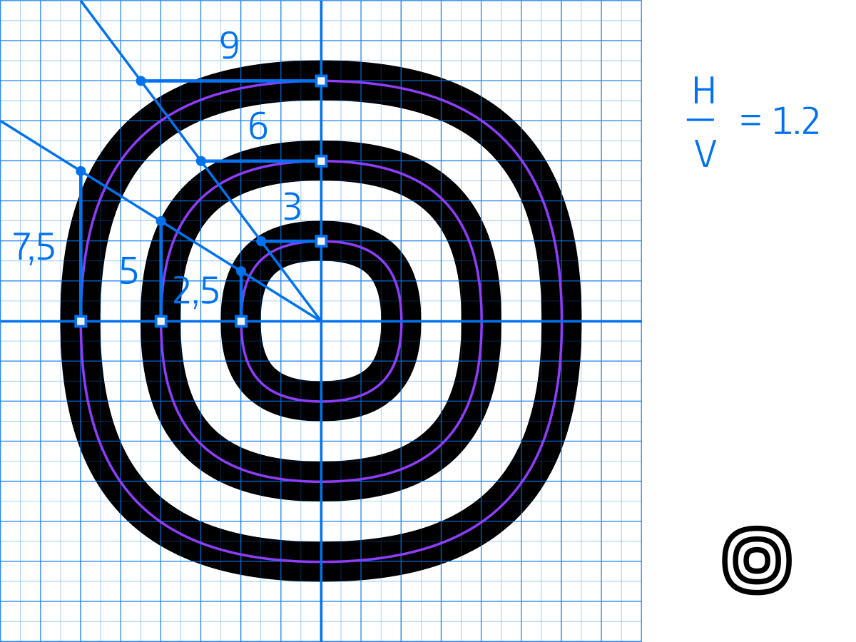
The handle ratio is defined as 1:1.2. This means that the relationship between the horizontal and vertical Bézier handles remains consistent across all curves.
When dividing the horizontal handle by the vertical handle, the result should always be 1.2.
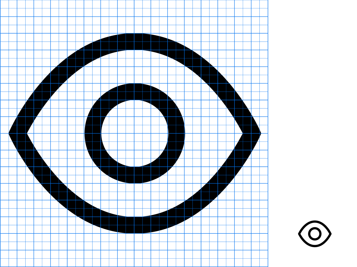
Use orthogonal curves only when the object is physically orthogonal. This ensures clarity and accuracy.
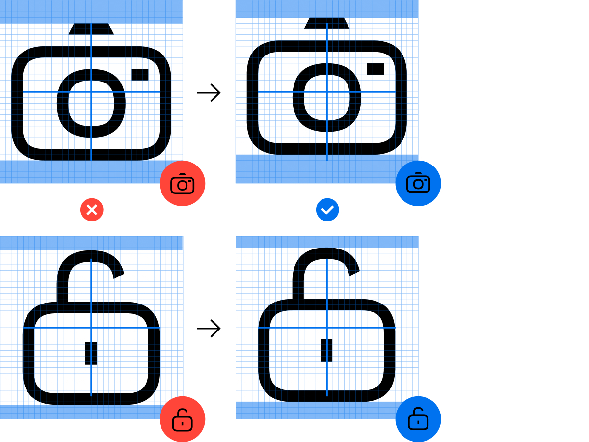
All icons should be centered vertically and horizontally inside the 32 x 32 grid.
Optical corrections to balance weight are acceptable but should always follow the grid lines.
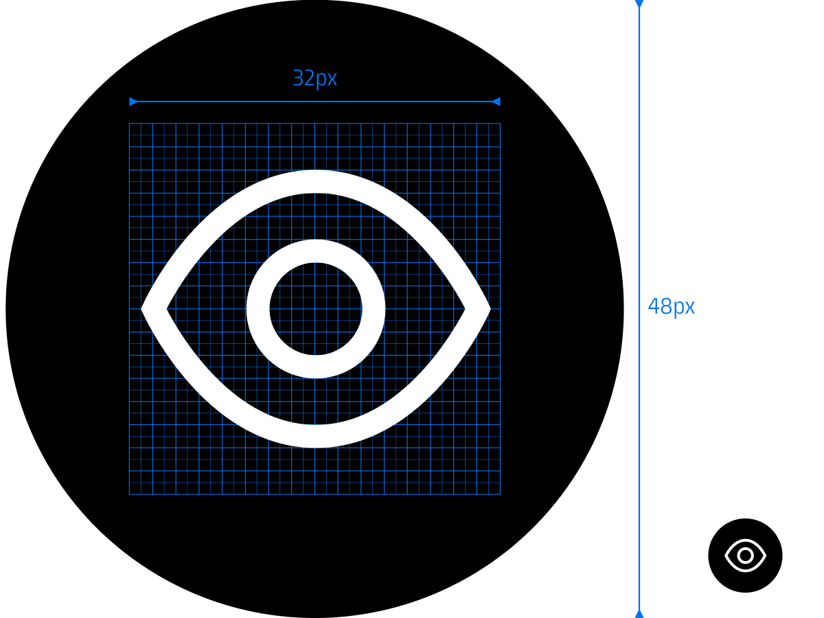
When placed inside a box, icons must be enlarged by a factor of 1.5 to guarantee accessibility and visual harmony. Example: A 32 px icon fits within a 48 x 48 px box container.
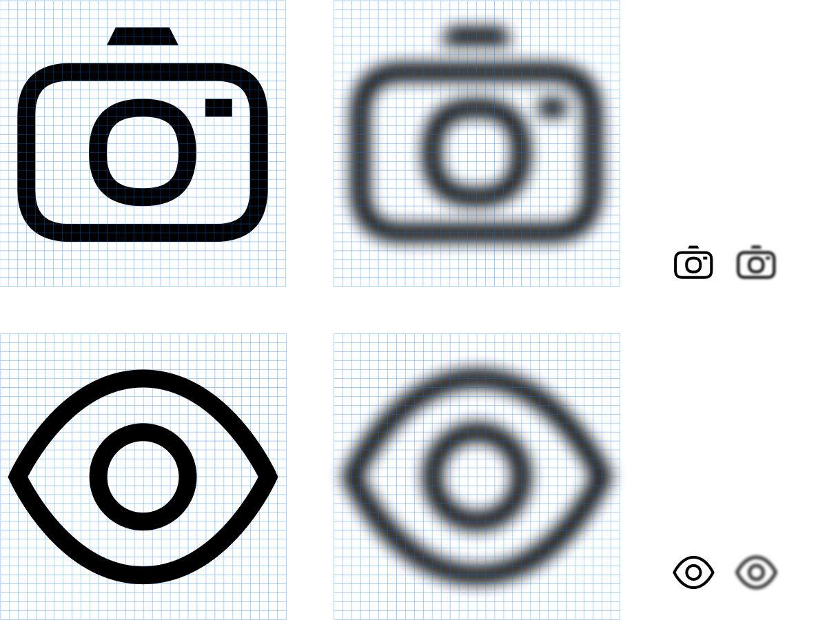
There must be sufficient contrast in the shape of the icon to ensure instant recognition.
Corporate Brand, Communications & Public Affairs